If you are paying attention to best practices of digital marketing and public relations, you know that key challenge here is to capture attention of social media users. Lets think of how do we tell a distinctive story visually? Here we will discuss 5 crucial steps to develop appealing graphic content.
The following case study analysis will help you to create an illustrative, memorable and engaging visual messages that you need.
Where to start
The best way to start would be planning. Start with defining the goals, target audience. Select the channels and chose tactics. It will make sure you in control of creative content, response and achieve the desired results. The essence of storytelling is the transmission of events in words, images or sounds. Maintaining basic principles, visualisation adds specific to it. One of the important components of visualisation to consider is the arrangement of elements.
Putting structure together
The structure to be created covers two dimensions: narrative and visual. The structure of the visuals is called composition. It can be static or dynamic. Examples of basic composition techniques in photography can be found at CompositionStudy.com, in films at ElementsOfCinema.com. In web design composition is called page layout. While web developers are experimenting with it, some latest trends are highlighted in the article by The Next Web.
The structure of the story is shaped by the plot. Wiki defines a narrative plot as “a sequence of events inside a story which affect other events through the principle of cause and effect”. Idea behind the storytelling is that there is a limited amount of the plots. In 1863 Gustav Freytag introduced a pyramid based on Aristotle’s theory of tragedy. The model is comprised of 6 phases: exposition, rising action, climax, falling action, resolution. According to Sir Arthur Thomas Quiller-Couch the type of conflict is what categorises plots into types. There is a wide variety of plots described by sociologists and writers.
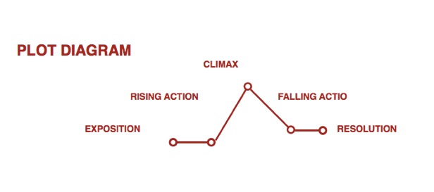
The set of the most common plots is outlined in the monumental work of Christopher Booker The Seven Basic Plots: Why We Tell Stories
Composition of both narrative and visual story plays central role in delivering key message to the target audience and requires a thorough organisation.
Evoking emotion
A deeper emotional connection results in a stronger bond. Thus it is critical to identify what makes powerful visuals. As we discussed above a part of it is lighting, style, location, weather, movement, close-up shots. To my mind, the most relevant and underestimated factors for evoking emotion in visual storytelling were presented by Getty Images’ Director of Visual Trends, Pamela Grossman
Pamela provides the 4 Key Factors for powerful visuals:
- Authentic visuals
- Culturally relevant to the audience
- Visuals that reflect the human experience
- Archetypal characters
Rather do not use the generic photos.Especially translating vague messages
This slideshow requires JavaScript.

Image Credit: Stock Photography
While being an imitation, this image has style and class, good colour palette and composition.Nonetheless, David Meerman Scott in the article Who the hell ARE these people? highly recommends to use images of real people instead. Nice example of authenticity, are the photos of Zynga’s Headquarters in San Francisco.
This slideshow requires JavaScript.
Image Credit: Jason Madera
Finally theres one more trend to metion in social media. The animation and the use of short videos. While Facebook introduced a super short video profile option, services like Coub and Giphy diversify digital content creating interactive storyboards or letting play with videos.
Colour Matters
Colour perception is conditioned by neurobiology and thus much appreciated in visual storytelling.
“Colour can have political, religious and cultural connotations, represent gender and as believed by Kandisnky, have emotional and physical effects on us. Colour can also improve our memory, influence buying decisions, indicate meaning and tell stories. It’s that very last one that interests me most.” Robert Mills
Robert Mills is the author of A Practical Guide To Designing The Invisible . It reviews “colour, typefaces, icons and tone of voice in relation to how we can tell stories on the web” and is an interesting reading. Another must-read on the use of colour in films is It’s Purple, Someone’s Gonna Die: The Power of Color in Visual Storytelling. It is concise and has a lot of useful insights.
A great work is being done by graphic designer Roxy Radulescu . Her blog Movies In Color has a library of 389 film palettes.
This slideshow requires JavaScript.
Image Credit: Roxy Radulescu
Good source to explore palettes is ColourLovers.com www.colourlovers.com/ You may discover 4,231,778 user-created color palettes to inspire and 5,310,377 user-created seamless patterns to use in creative processes.
Cross-channel multi-platform distribution
The procedure of building content should be aligned with the strategy of its further cross channel distribution. In order to do so you need to define where is your audience first. Once it is located, time to grasp it by distributing targeted message on mobile and desktop applications. Platforms like Linkedin are more business oriented.Twitter, Youtube, Facebook can be used as a tool for both business and consumer publics.
In his post Marketing In The Year 2016 Gary Vaynerchuk actively advocates Snapchat and Instagram as the next big thing in consumer media and advertising which is fairly true from my own observations. The half-minute tip of What It Means To Market Today from the New York Times and Wall Street Journal best-selling author, VaynerMedia founder and serial entrepreneur Gary Vaynerchuk is an amusing illustration.
Data visualisation
Data Storytelling is a trend. Big data generates potential for new ideas, revenue streams and business models. Our focus is transformation of data into the visual stories.
The infografic belows says that poor need to change their life approach primarily as it is evident from their responses. However it may take a couple of hours to figure out why.The graph is a nice piece of art. Sadly it makes no sense.
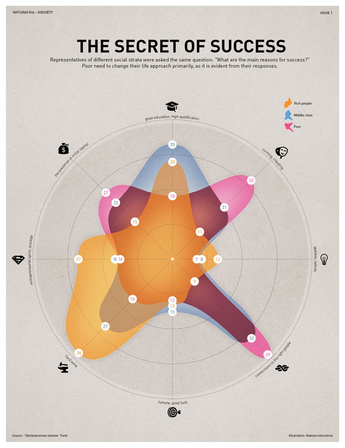
Image Credit: Maksim Abrosimov
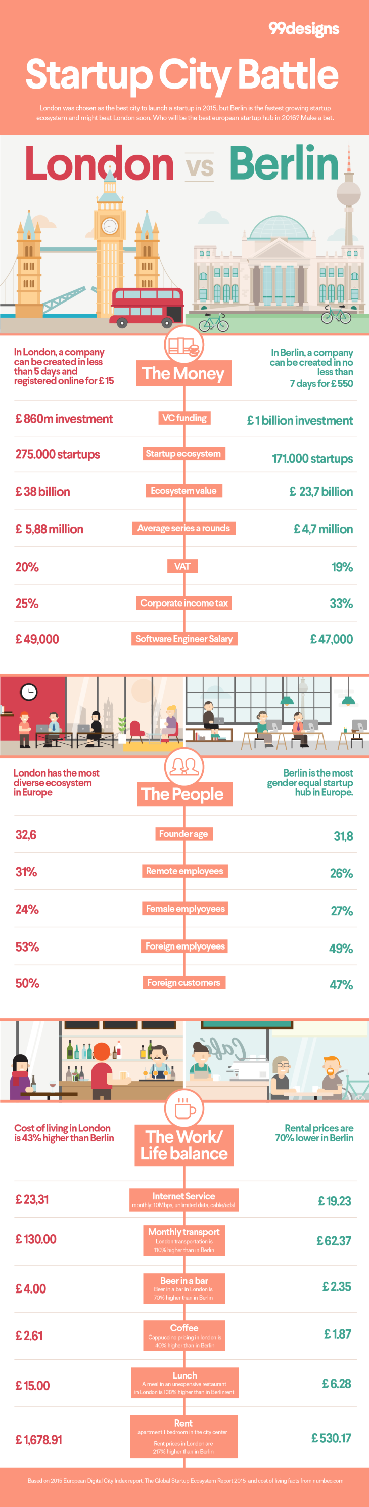
An example of good data visualisation is comparison of London and Berlin as a place to set up a business made by 99designs.co.uk Its colour palette is appealing and data is sufficient, structured and readable.
For basics we can approach Edward Segal and How to Tell Stories with Data (Really)
However research conducted by Nick Diakopoulos Visualization Rhetoric: Framing Effects in Narrative Visualization shows that study of the data visualisation field is insufficient. The paper classified rhetoric used in the 51 narrative visualisations. It “proposes future investigation of the power of rhetorical techniques to manipulate user interpretations supports a call for increased responsibility among designers to consider the possibly unintended effects their choices may have”.
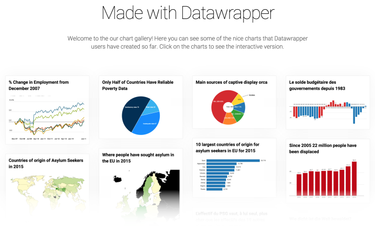
In the meantime, free tools like Data Wrapper, Piktochart are used to frame fact sheets for media kits, presentations and quality infographics remains a better way to communicate statistics then xls spreadsheets, effectively moving data beyond the chart and making graph itself represent.